Relax! Tropical Sunset Card Using Gina K Stamps and Distress Inks

A sunny hello to you poor Northern peeps who have been freezing in the latest round of storms! We had visitors from Indiana who got sick and didn’t get to enjoy the beach as much as they’d hoped, so I made them a card so they could take the beach home and enjoy it with their heat cranked up!

I chose the sentiment Relax! That’s what sunrise and/or sunset at the beach does for me! I hope they find this pretty scene relaxing, too! Just a quick note on some of the details… The background was blended distress inks (including Barn Door for the current Simon Says Stamp Monday Challenge: Add Some Red). I was worried they might get it wet, so I sprayed over it with Krylon’s Triple Thick Clear Glaze. It worked pretty good… there’s only a spot or two that reacted with the moisture before it sealed. I love the glossy photo finish it gives as I tried to catch above! The black ink was MFT Extreme Black, which went stood out nicely stamped over the Distress Inks.

The dolphin — I wish I’d’ve done him separately, cut him out and added him, as I ended up with a lot of ‘sunspots’ from the black powder adhering to the already embossed sun despite using an anti-static doo-dad and the dolphin started to melt into the sun. Learning experience. It’s still cool and can be ‘perfect’ next time! I do love the ‘wet’ look of the embossed dolphin!

The water — I figured it was best to emboss the sun and it’s reflection on the water first so I could just blend over it and wipe off. It worked, but don’t use a paper towel or baby wipe that’s too wet, or the water will react with your Distress Inks, too. Voice of experience! The waves around their feet are drwan in with a Pigma Micron pen. I think I’ll start off my note to them on the inside: ‘This card has a porpoise!’ Lol! Supplies:

  • Gina K. Designs Framescapes Tropical Skies stamp set
  • Core’dinations white cardstock
  • DCWV peach card
  • Ranger Tim Holtz Distress Oxide ink: Antique Linen
  • Tsukineko Versamark ink
  • JoAnn Craft Essentials clear embossing powder
  • Inkadinkado black embossing powder
  • Ranger Tim Holtz Distress inks: Broken China, Stormy Sky, Victorian Velvet, Barn Door (Red) and Spiced Marmalade
  • MFT Extreme Black ink
  • Sakura Pigma Micron black 05 pen
  • Krylon Triple Thick Clear Glaze
  • Scotch adhesive tape runner

I am playing along with the following challenges – click on any one for more information on how you can join the fun!

Thanks for joining me! I hope YOU have a RELAXING day, too!

~D.Ann

.

p.s. any ads on this page are placed by WordPress and are not endorsed by me.

Stamplorations Love Always Card with Salt Colored background

Hi there! Welcome back to another crafty whim! This time I’m experimenting with a ‘digi’ and watercoloring with salt. Because a printed ‘digi’ (digital image) from my printer often smears, I decided to do the background FIRST and then print on top of it. I really wanted to play with this nifty technique I’d seen on Betsy Veldman’s blog (HERE). She had a cool variation of the salt technique — where you sprinkle salt on your watercolor and let it dry for some interesting patterns. She COLORED her salt and sprinkled it around for some really cool effects! I especially liked her aqua border with flowers, so decided to try something similar. I guestimated where the orchid and lily would fall and tried to get the yellows and pinks more in those areas. Since I wasn’t going to do much until I was sure I could get similar results, I colored up 1/4-1/2 tsp of coarse salt.

The handiest colors I had on hand were distress inks and spray stains. It only took 2 drops of the ink, but about 6 of the spray stain to color up the salt. I didn’t have a purple, so mixed Mermaid Lagoon with Abandoned Coral until I got the color I wanted. By the time I sprinkled my salt down, the paper was dryer than I’d’ve liked, so I gently spritzed a bit of water across the top. Let dry and brushed off the salt:

Sherry Russ at Stamplorations kindly made available these lovely free digis over on their blog (HERE):

You know I rarely use digis, but I decided to give this lovely one a whirl. First, I had to size the digi. Another reminder of why I prefer stamps. Sure you can resize digis easier, but getting them exactly right is a bit of trial and error (for ME, at least!)

Not bad, but I thought it could use a little more. When Betsy was done with the salt, she went back and added some more watercolor. I was afraid to re-wet the surface as these were distress inks and would react with the water, so I chose to use some Copic markers to make the leaves and a few details stand out, then added a bit of sparkle…

In the end, it turned out nifty, but not near as cool as Betsy’s projects. Some day I will have to come back and revisit this, experimenting with different watercolors and inks.

Supplies used:

  • Stamplorations framed Love Always digi (Free HERE)
  • Ranger Tim Holtz Distress Watercolor cardstock
  • Yasutomo Metallic Watercolors
  • Ranger Tim Holtz Distress Ink – fossilized amber
  • Ranger Tim Holtz Distress Spray Stain – abandoned coral & mermaid lagoon
  • Costco Kirkland Mediterranean Sea Salt
  • Copic markers: C3; G24, 82; RV17; V6; YG17, 61; YR2, 4
  • Spectrum Noir by Crafter’s Companion Sparkle pen – clear
  • Scotch adhesive runner
  • Core’dinations Parisian Nights card base

I’m playing along with the following challenges – click on any one of them for more information on how you can join the fun:

20190201_stamplNE

Thanks for stopping by and for sharing your comments!

~D.Ann

.

p.s. any ads on this page are placed by WordPress and are not endorsed by me.


Die-Versions Seaside Sunset Thank You Card

It’s time for another card for the Summer 2017 Coffee Lovers Blog Hop.


This one is for one of the fab baristas at my local Starbucks who is going away…

Isn’t that a FUN die cut?!! It was easy to watercolor. Then I used the IrRESISTible Pico Embellisher to outline the circle and on the sentiment and corners. It dries raised as if it were embossed, but has a delightful translucent shimmering gold shine.

On the inside I used more of the Starbucks stickers and a couple of coffee cup clips with the gift card holder that they give you to hold the card in place.

Materials used:

  • Die-Versions Whispers “Seaside Sunset” & Sweet Spots “Oh Thank You” dies
  • Spellbinders Antique Frame Accents dies
  • Core’dinations white cardstock
  • Ranger Tim Holtz Distress inks: Mowed Lawn, Mustard Seed, Peacock Feathers, Pumice Stone, Spiced Marmalade
  • Imagine Crafts IrRESISTible Pico Embellisher Gold
  • Simply Defined “Stay Put” All Purposed Liquid Adhesive
  • Starbucks stickers
  • Pigma Micron green 005 Archival Ink pen
  • The Paper Studio Flea Market Fancy Gold Coffee Cup Paper Clips

I am playing along with the Summer 2017 Coffee Lovers Blog Hop click on it for more information on how you can join the fun.

Thanks again for stopping by!

~D.Ann

.

p.s. any ads on this page are placed by WordPress and are not endorsed by me.

MFT Camp Create Day 4: Sensational Sliders – Hilarious ‘Ruff Day’ Card

Hello and welcome! Today’s project is from Day 4 of My Favorite Things Camp Create: Sensational Sliders.

I love interactive, touchy-feely cards! This one took a little extra measuring since I didn’t have the Blueprint plate used in the demo, but it was worth it! I left a 3/4″ edge around the 5 1/2″ x 4 1/4″ card, cutting two 4 inch sides and one 2 3/4 side with a semi-circle traced from a AA battery in the middle.

And when you pull the slider open:

I know it’s kind of yucky, but it still cracks me up! Here’s a behind-the-scenes look… After blending in the ink for the sidewalk, grass and sky (each masked off as I went), I spritzed a little water and then randomly flicked in some grass blades.

Here’s another reason why the We R Memory Keepers Precision Press has a slight advantage over the MISTI:

For the peepee I used the Nuvo Morning Dew Crystal Drops that dry clear and, when dry, I ran a yellow Copic marker over it.

Now, here’s a test… Did you happen to notice the dog’s name? If you missed it, you can scroll back to the first picture…. Yep, a true Boca Ratonian! I know another one called Dee-Oh-Gee…. think about it… say it slow…! : )

Materials used:

  • My Favorite Things: BB You Make My Tail Wag stamps
  • Core’dinations white cardstock
  • Memento Tuxedo Black dye ink
  • Ranger Tim Holtz Distress Inks: Mowed Lawn, Old Paper, Tumbled Glass
  • Ranger Tim Holtz Distress Ink pen: Twisted Citron
  • Copic markers:
    • Doghouse: C1,3,5,7; R24, 29
    • Dog: E13, 23, 25, 31, 33, W1
    • Hydrant: C1, 3, Y17, 35
  • Tonic Studios Nuvo Crystal Drops: Morning Dew
  • Pigma Micron 005 Archival ink pen: Black
  • Tombow Xtreme permanent adhesive

This earns the 4th Camp Create badge:

I’m entering these cards in the following hops and contests. Click on any one of them for more information on how you can join the fun:

There’s still one more day of this fun ‘camp,’ so I’ll be back soon!

~D.Ann

.

p.s. any ads on this page are placed by WordPress and are not endorsed by me.

Guest Designing for CropStop – Heartfelt Creations Daffodils-from-Orchids Card

Hooray! Today is the day I finally get to share with you the exciting secret I’ve been busting to tell you… I was invited to be a guest designer of a project for the CropStop blog! If you happen to be coming from there… WELCOME!!

I was totally surprised and nervous as all get-out for my first ever privilege of being a guest designer! I hope you like my first project… I happen to think it’s one of my best cards. I’d be tickled pink if you would pop over to the CropStop blog and leave some love! Here’s a TINY sneaky peak to pique your interest:

I know you’re going to want to see the details close up… you can click the link HERE to get to the CropStop Blog. Meanwhile, I’ll sit here and twiddle my thumbs while you go check it out!  When you’re done, please come on back here and I’ll share some extra details and tips with you, ok?!

Are you still here? I wish I knew how to embed music into my post, but since I dont, let me send you on your way by humming the theme from 2001: A Space Odyssey for dramatic effect while you click on the link HERE to go check out the project…. duuuum, DuuuuuM, DUUUUUUMMMM, TaDUUUMMM!….

* * * * * * * * * * * * * * * * * * * * *

So, what’d’ya think?! I hope you liked it as much as I did! Of course you know things always look better in real life… wish you could see it for real!

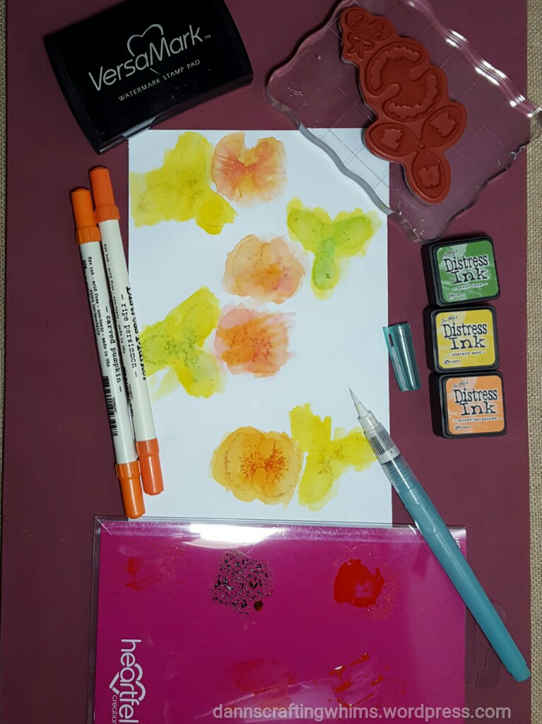
Here’s some of the extra details that I didn’t want to overwhelm the folks at the CropStop blog. I played around with different ways to color the flowers… The first ones I stamped with Versamark ink and then watercolored with Distress inks by putting the ink on some plastic and picking it up with a water brush.

Note: For those of you who don’t have a MISTI or other stamping device, I highly recommend using the red 11×17 Rubber Stamping Mat under your paper to help get a nice evenly stamped image.

Also, if you don’t have a palette made specifically for watercoloring, you can use any hard plastic, like an old cd, a cd cover, or the packaging from your stamps, like I did.

You can see I wasn’t worried about staying in the lines as the die would cut away the excess. I did want to go OVER the lines to get a little extra dark coloring where the Versamark stamped image was.

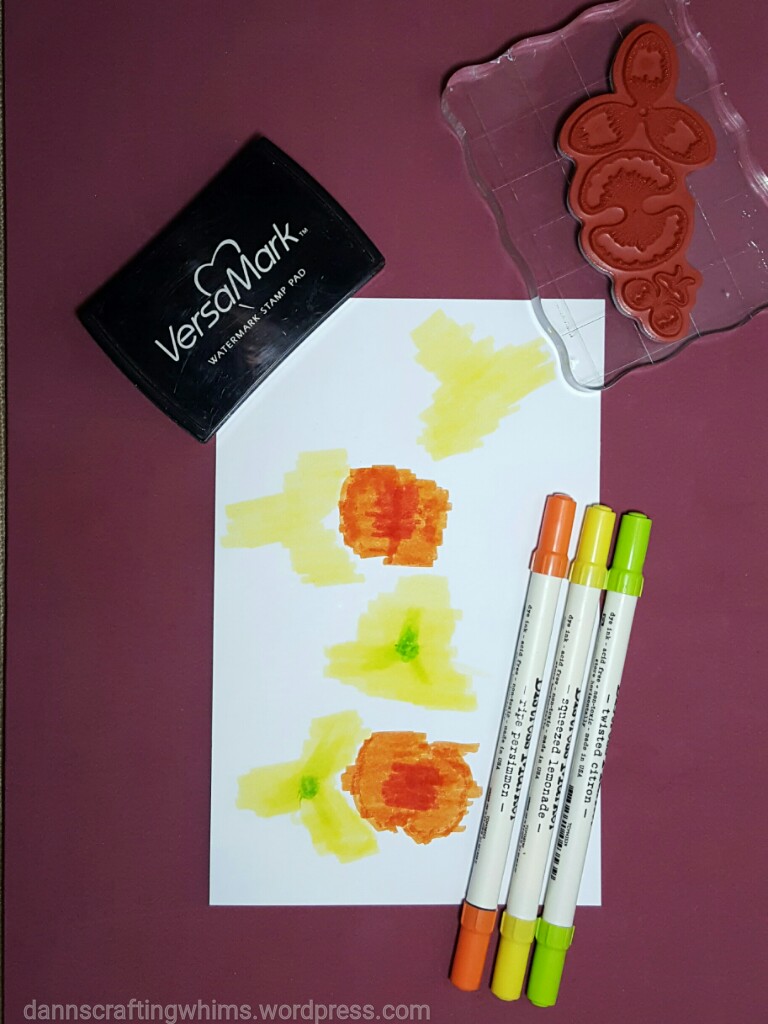
For the second set of flowers I colored directly with the markers.

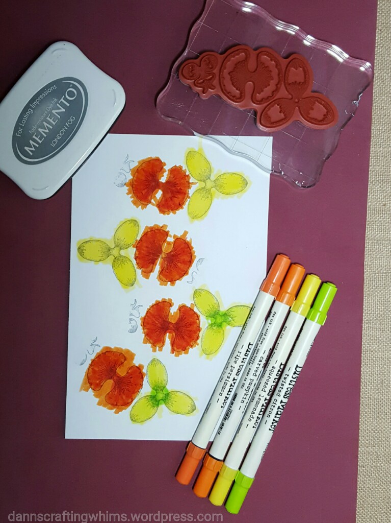
And, for the final set of flowers, I stamped with a light gray ink instead of Versamark and colored directly with the markers again. I also colored the back sides of each flower.

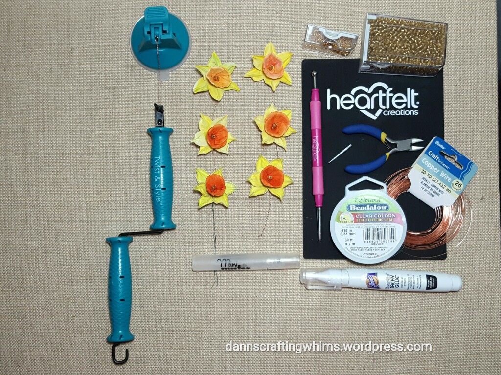
These are the Heartfelt Creations Botanical ORCHID stamps. Emma Lou of Heartfelt Creations has a nice video showing how to use these to make the DAFFODILS HERE.

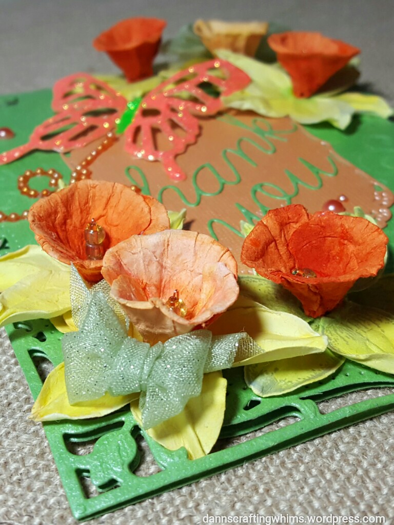
Here are the finished flowers in the order I made them:

If you want a softer color, the watercolor works, but for brighter colors, coloring direct on the page works better. You will loose some color with the wetting required to shape the flowers. (Note, I also tried this with Color Bursts, but they washed out too much. FYI, you would have to start out with a really dark color to allow for the loss of color in the wetting and shaping process.)

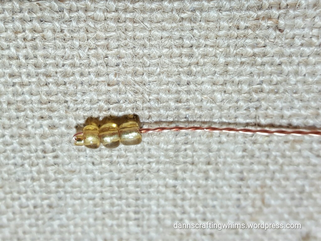
I used the Twist & Style Sizzix so kindly sent me a while back to make the stamens out of beads and wire stems. It makes quick work of wire twisting!!

Another thing I learned… The Beadalon 7 strand .015″ wire was a little too flimsy for the stems. The 26 gauge copper wire worked MUCH better. If I wanted them to stand up in a bouquet, I’d use an even heavier wire.

Here’s a close-up of the finished flowers. I took one of each different kind and put them in a bunch for variety and affixed them with Glubers.  Oh, and FYI, the butterfly got its fabulous shine from Stickles (Firefly and Tropical Tangerine).

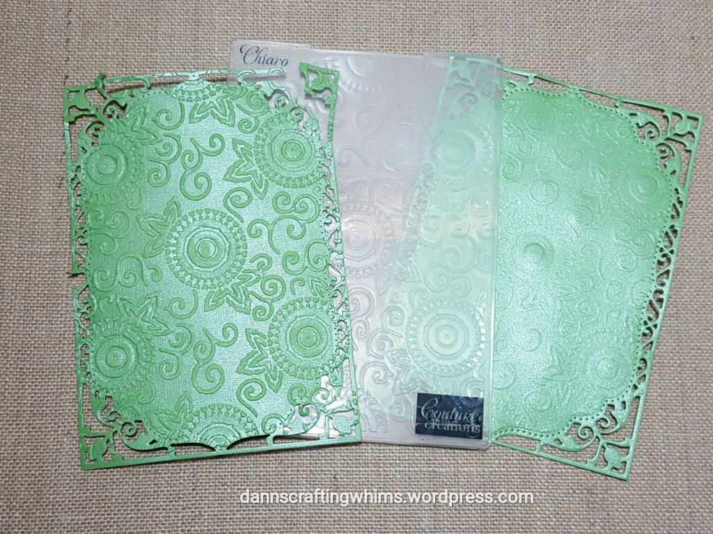
For the card base I wanted to have it embossed with the Couture Creations Serenity Collection: Chiaro 5×7 embossing folder that I won from CropStop back in January AND I wanted a nice cutout shape. This led to another learning experience…

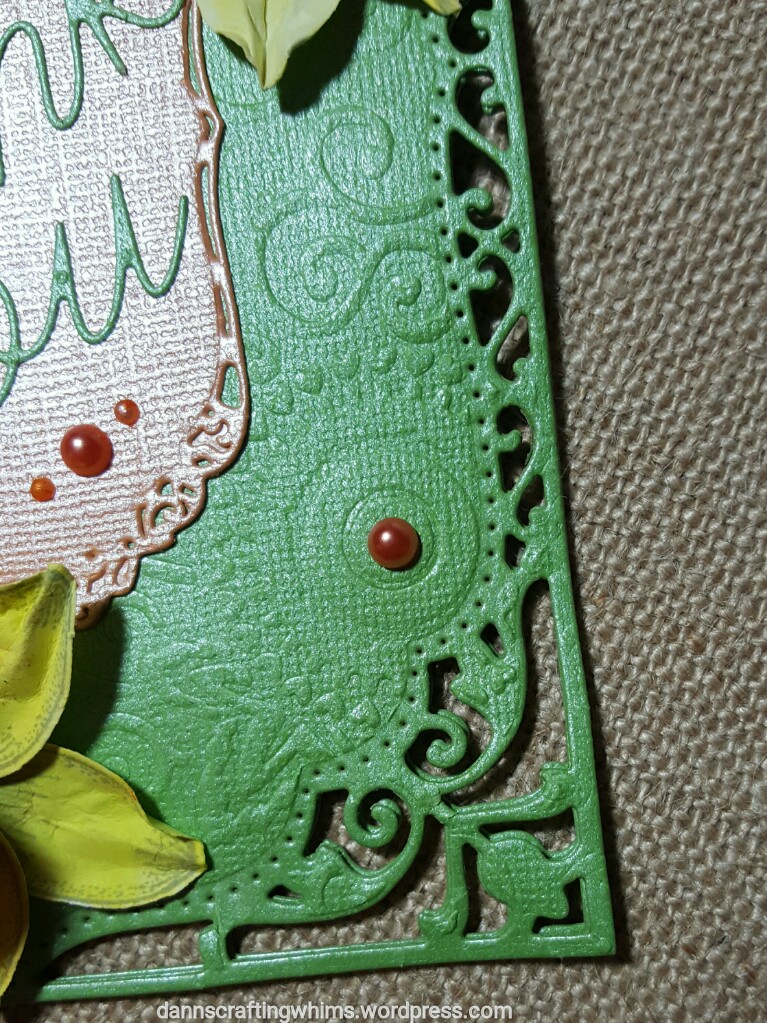
The die cut card was so delicate that the pass through the embossing machine ‘broke’ the paper apart in several places. It worked out much better to run the paper through the embossing folder first, THEN die cut it. In the process of die cutting it, it did flatten some of the embossing, leaving a much softer look and keeping the edges in tact.

Tip: Can’t find faux adhesive pearls to match your project? Use a Copic Marker to color plain ones!

You will find the list of all the supplies used on the CropStop Blog. You can click HERE to go back and check it out again. Thank you, CropStop, for the privilege of guest designing for your blog!

Well, as Paul Harvey used to say, “And now you know the REST OF THE STORY!”

I am also playing along with the following challenges… click on any one of them for more information on how you can join the fun:

You can also feel free to join in with the Cropstop March Challenge Linky Party #26: Anything Goes… It’s always fun to see the many lovely projects and you have the chance to win a nice prize or, perhaps, even be a guest designer!

Please stop back by Next Friday, March 24, for another guest designer post for the CropStop blog… this time a MUCH simpler pair of cards using some fun cut-and-fold dies… I’ll look forward to seeing you then!

This has been D.Ann reporting…. “Good day!” : )

.

p.s. any ads on this page are placed by WordPress and are not endorsed by me.


MFT Camp Create – Remarkable Resist – You Make Life Beautiful Card

Welcome back for yet another session of My Favorite Things Camp Create.

20160816_MFT3_0

This time the focus is on Remarkable Resist. That’s great because it fits Marker Pop’s Challenge #101: Embossing.

20160816_MarkerPop101

I took Simon Says Stamp’s Wednesday Challenge: Let’s Go Wild and went a little wild with coloring the background after heat embossing the lovely lace stamp:

20160816_154207

Hard to believe that’s only 4 Distress Ink Colors – They blend so well!! I love the bright, summery look! (SSS Monday challenge)

Supplies:

  • My Favorite Things BG Lace Background stamp & Simply Fabulous Sayings stamps
  • Coredinations cardstock: black & white
  • Ranger Tim Holtz Distress Inks: Mustard Seed; Peacock Feathers, Picked Raspberry & Spiced Marmalade
  • Tsukineko Versamark ink
  • Memento Tuxedo Black dye ink
  • Tombow mono adhesive

I’m playing along with the following challenges – click on any one for more information:

**** Edited to add: 20160822_MarkerPop101 Wa-hoo! ****

Well, that gets me another badge and half way through the camp sessions!

20160816_MFT3_3resist

I’ll be back tomorrow to post the rest. I’d be happy if you’d stop back by!

~D.Ann

.

p.s. any ads on this page are placed by WordPress and are not endorsed by me.

Stamp-a-Faire 2016 – Masterpiece Inspirations – Monet ‘Note for You’ Card

Goood morning peeps! Can you tell I’m finally feeling a little better?!! What a nasty virus!! Hopefully, now I can get these last few cards posted. So brace yourselves for a deluge of posts today. : )

20160723_SAF

The next session of Papertrey Ink’s Stamp-a-Faire 2016 was Masterpiece Inspirations with the Team. There’s an interesting clip of part of the commencement speech Neil Gaiman gave to the Pennsylvania University of the Arts 2012 graduating class (here). Each of the designers did a fab and inspiring job of taking a masterpiece as inspiration for their projects!

I’ve always been fond of Monet’s works, especially his water lilies, which is probably why I also love the McKee Botanical Garden, as areas of it remind me of his pond:

20140621_091602a_wm

So, I chose to use Dawn McVey’s inspiration of Calude Monet’s Waterlilies as a springboard for my card.

20160724_SAFmonet


Here is what I came up with:

20160725_104226

I watercolored the background and, to add dimension and texture, I cut out the Garden Gild cover plate die and watercolored it, too. Then, like the true blonde that I am, I discovered my watercolored background was too small for the cover plate die cut. Argh! But with a little snipping, it was easily sized down and barely noticeable.

20160725_104241

Supplies:

  • Papertrey Ink Make it Market Mini: Garden Gild cover plate die
  • Papertrey Ink Floral Sketches stamp set
  • Canson cold press watercolor paper
  • Ranger Tim Holtz Distress inks: Dusty Concord, Mermaid Lagoon, Mowed Lawn, Peacock Feathers, Peeled Paint, Picked Raspberry, Salty Ocean, Shabby Shutters, Spun Sugar, Squeezed Lemonade, Wilted Violet
  • Versamark ink
  • Recollections Neon Rose embossing powder
  • Recollections shimmer card
  • Tombow Xtreme permanent adhesive
  • Aleene’s Tacky Glue

I’m playing along with the following challenges – click on any one if you’d like more details as to how to play along:

I’ll be back soon! Thanks for stopping by and for all your encouraging comments!

~D.Ann

.

p.s. any ads on this page are placed by WordPress and are not endorsed by me.

MFT Camp Create – Magnificent Masking – Hello, Sunshine Card

Here I am yet again with a card from the next session of My Favorite Things Camp Create

.20160721_MFT0

This session was on Magnificent Masking.

20160721_181541

I masked this two ways… First I used Fineline masking fluid on the stamped images. Toucans are one of my favorite birds (tied with pelicans and hummingbirds). I met several when I lived in South America and they’re quite gregarious. I giggle with him sitting on a pineapple… the fruit of summer – liquid sunshine!

20160721_181815

Then, I used a stencil to mask off the concentric circles representing sun rays.

20160721_181918

Then I sponged two colors of distress inks over the masks.

Here’s the badge earned for this session:

20160721_MFT4 20160721_181601

Materials used:

  • My Favorite Things BB Polynesian Paradise stamp set
  • My Favorite Things Concentric Circles stencil
  • Memento Tuxedo Black & Pear Tart dye inks
  • Ranger Tim Holtz Distress Inks: Mustard Seed & Spiced Marmalade
  • Copic Markers: B29, 69; C3, 7; R29; Y13, 15, 17, 28; YG61, 63; YR04, 07
  • Recollections white and orange cardstock, shimmer card
  • Scrapbook Adhesives by 3L E-Z Runner permanent adhesive

I’m playing along with the following challenges – click on any you’re interested in for more information:

I’ll be right back with the final card from the camp: Background Bonanza.

~D.Ann

p.s. any ads on this page are placed by WordPress and are not endorsed by me.

MFT Camp Create – Inlaid Made Easy – Amazing Flamingos Card

I’m back again as I continue posting my cards from My Favorite Things Camp Create.

20160721_MFT0

The next session was Inlaid Made Easy:

20160721_122515

I experimented with a watercolor sunset on the water scene – obviously I need more practice with that. (True story: for a while it looked like one flamingo ate something that didn’t agree with him. hahaha!) Then I die cut out the flamingos and the word Amazing. Then added them back in with foiled and glitter papers. At least it there weren’t too many fiddly little pieces to re-position.

Here’s the badge earned from this creative session:

20160721_MFT3  20160721_122533

Materials used:

  • My Favorite Things LLD Flamingos & Doubly Amazing die-namics
  • Canson Cold Press Watercolor paper
  • Ranger Tim Holtz Distress Inks: Festive Berries, Mermaid Lagoon, Picked Raspberry, Salty Ocean, Spiced Marmalade, Tumbled Glass
  • Recollections glitter paper, foiled paper and shimmer card
  • Copic marker RV19
  • Misc. adhesives

I’m playing along with the following challenges – click on any you’re interested in for more information:

I’ll be right back with the next card from the camp: Magnificent Masking. (I DID warn you there would be several posts today!)

~D.Ann

p.s. any ads on this page are placed by WordPress and are not endorsed by me.


Clear & Sheer Class – Day 1 – If Friends Were Flowers Watercolor Cards

What a week it’s been. After battling a severe allergic reaction and being 3 days without internet, I’m glad to be back with you again. I was tickled pink to be given the Clear & Sheer Online Card Class by a dear friend.

20160427_ClearSheerClass

In case you’re interested, it’s all about using vellum and acetate on cards and there have been many ultra cool techniques that made the class totally worth the small price!

Day 1 was all about attaching vellum… it’s often a challenge to hide the adhesive since vellum is transparent. I’ve been wanting to try a watercolor technique the talented Kelly Latevola showcased on the Newton’s Nook Blog a while ago. You can see her video HERE. I had also received some of the Zig Clean Color Real Brush pens and I wanted to compare them to my Tim Holtz Distress Inks. I’ve been excited by the vibrancy I’ve been seeing in projects using the Zigs. My results were surprising…

20160502_192606aW

The more vibrant card on the left was done with Distress Inks and the softer colors on the right were the Zigs. Perhaps they’re lighter because it was done as a watercolor technique and not direct to paper. To attach the vellum sentiment, I wrapped the strip around to the back and secured it with adhesive. It still wanted to lift up a bit, so I stuck a drop of blue near the sentiment and covered it with a sequin. The vellum butterflies had enough embossed design on the body to cover any adhesive and the wings float free.

A couple of other things inspired this card –

One was this month’s Newton’s Nook challenge to use this sketch…

20160502_NN

Well, my project is roughly divided into three sections, but I took huge creative license and put a butterfly in the middle instead of a tag…. I’m hoping Newton and Hobbes won’t complain too much, but a tag just didn’t look right. : )

Another influence on this card were Verve’s April Diva Inspiration Challenge colors:

20160502_Verve

20160502_192620aW

Materials used:

  • Newton’s Nook: Beautiful Blossoms and Beautiful Wings stamp sets
  • Canson Cold Press Watercolor paper
  • Versamark Ink
  • Inkadinkado Linen White embossing Powder
  • Ranger Tim Holtz Distress Inks:
    • Mowed Lawn, Mustard Seed, Peacock Feathers, Picked Raspberry, Shabby Shutters, and Spiced Marmalade
  • Copic Markers:
    • BG13; C1, 3, 5; E29; RV34; Y32; YR02, 04; V09
  • Spectrum Noir Sparkle pen – clear
  • Foray Transluscent Inkjet Vellum 30#
  • Recollections Neon Pink Opaque embossing powder
  • Recollections Detail embossing powder – Ebony
  • Recollections Shimmer card
  • Craftin’ Desert Divas sequins – Sweetness Mix
  • Tombow: Xtreme permanent adhesive and mono liquid glue

20160502_192655sW

Materials used:

  • Newton’s Nook: Beautiful Blossoms and Beautiful Wings stamp sets
  • Canson Cold Press Watercolor paper
  • Versamark Ink
  • Inkadinkado Linen White embossing Powder
  • Kuretake Zig Clean Color Real Brush pens:
    • 025, 031, 041, 050, 070
  • Copic Markers:
    • BG13; C1, 3, 5; E37; RV34; Y32; YR02, 04; V06
  • Spectrum Noir Sparkle pen – clear
  • Foray Transluscent Inkjet Vellum 30#
  • Recollections Neon Pink Opaque embossing powder
  • Recollections Detail embossing powder – Ebony
  • Recollections Shimmer card
  • Craftin’ Desert Divas sequins – Sweetness Mix
  • Tombow: Xtreme permanent adhesive and mono liquid glue

20160502_192620b 20160502_192655b

I’m going to enter one or both of these cards (either linked from here or Instagram) into the following galleries and challenges – You can click on each one for more information:

Barring further Internet issues, I’ll be back tomorrow with some cool projects from day two of the Clear and Sheer class!

G’nite for now!

-D.Ann

.

p.s. Any ads you may see are placed by WordPress and are not endorsed by me.